10 standout fonts for your food, drink, or lifestyle product branding + packaging
For startup food, drink, and lifestyle brands, great packaging does a lot of heavy lifting– it tells your story, catches the right eyes, and helps you earn a spot in someone’s heart (and cart). As a new brand, choosing the right font is one of the most powerful ways to show what you’re about. Whether you're bottling small-batch hot sauce, brewing canned cold-brew, or launching a clean skincare line, the right typeface will make your packaging pop and your messaging stick. Here are 10 standout fonts that blend charm, clarity, and a little edge—perfect for up-and-coming brands ready to make their mark.
bd caramel variable (free*)
credit: BLC Design
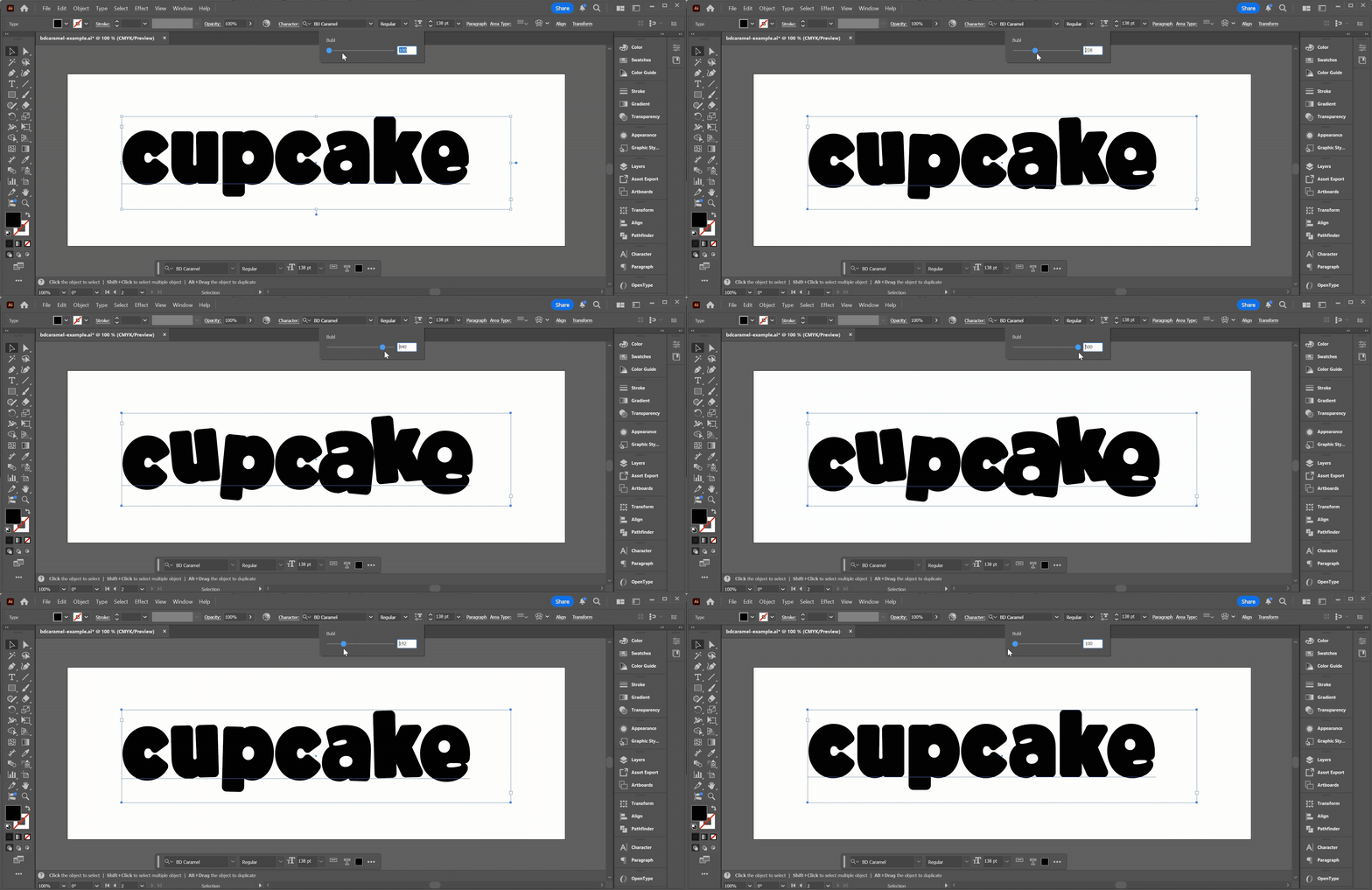
BD caramel is playful and buoyant with its bold, rounded corners. The font is variable in that it allows you to adjust the amount of “bubl” which is is a combination of character tilt and deviation from baseline. There are also built in “regular” and full “bubble” settings, but the extra customizability really lets you hone in on the amount of silliness and irregularity you want to convey. This font is so full of character already, but it ripe for additional customization, as in the popcorn example above, where the popcorn forms the negative space (the “counter of the o.
credit: BLC Design
visual keywords: playful, buoyant, rounded, effervescent, bubbly, bold, thick, soft, pillowy, silly, luscious
perfect for: popcorn, baked goods, puffed snacks, bakeries, bubbly beverages, children’s snacks
*free with Adobe Creative Cloud subscription
2. cape ($)
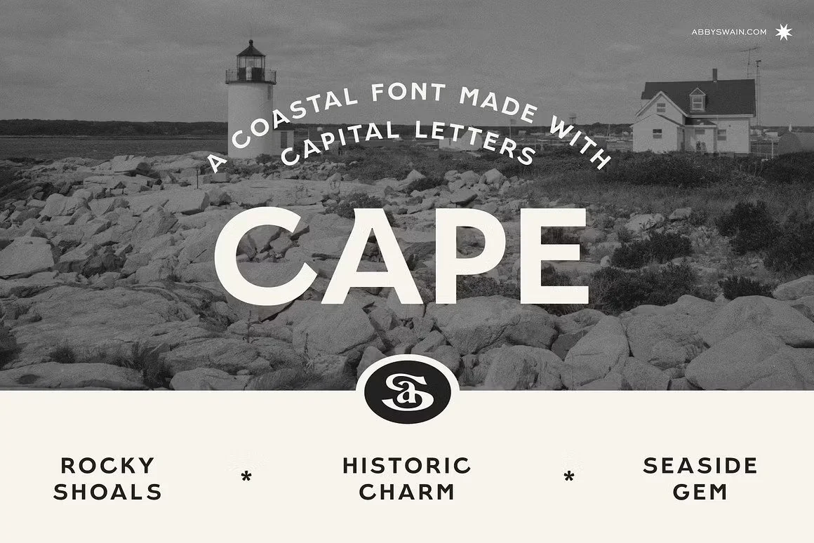
Cape is a sans serif display font inspired by vintage coastal hand-painted sign lettering from Abby Swain Design. Despite its vintage vibe, it is still modern, with small human touches that give it a sophisticated yet artisan feel.
visual keywords: artisanal, bold, modern, vintage, imperfect, sophisticated, upright, coastal, historic, whimsical
perfect for: artisan food products, potato chips, seafood, breakfast burritos
$- Under $50 for a desktop license
3. camp coffee ($)
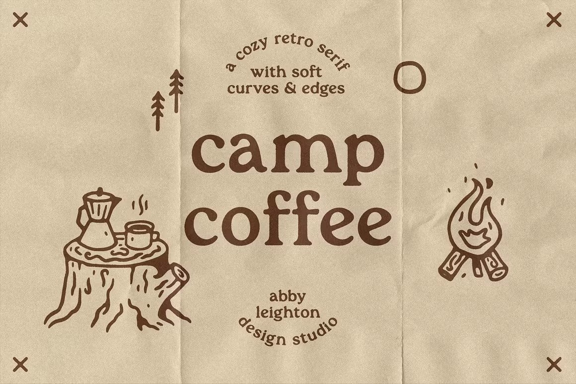
Camp coffee is a soft, cozy, retro font from Abby Leighton Studio. It works great in all lowercase or in sentence case and is very on trend. It gives a casual, inviting vibe. It is reminiscent of hornbill, a font that was huge in the ‘60s and ‘70s, adding to its carefree, free-spirited association.
visual keywords: cozy, soft, vintage, free-spirited, carefree, inviting, friendly, casual
perfect for: baked goods, coffee, skincare, tea, kombucha, artisanal food products
$- under $50 for a desktop license
4. queens, queens sans, + queens sans extra ($$)
credit: BLC Design
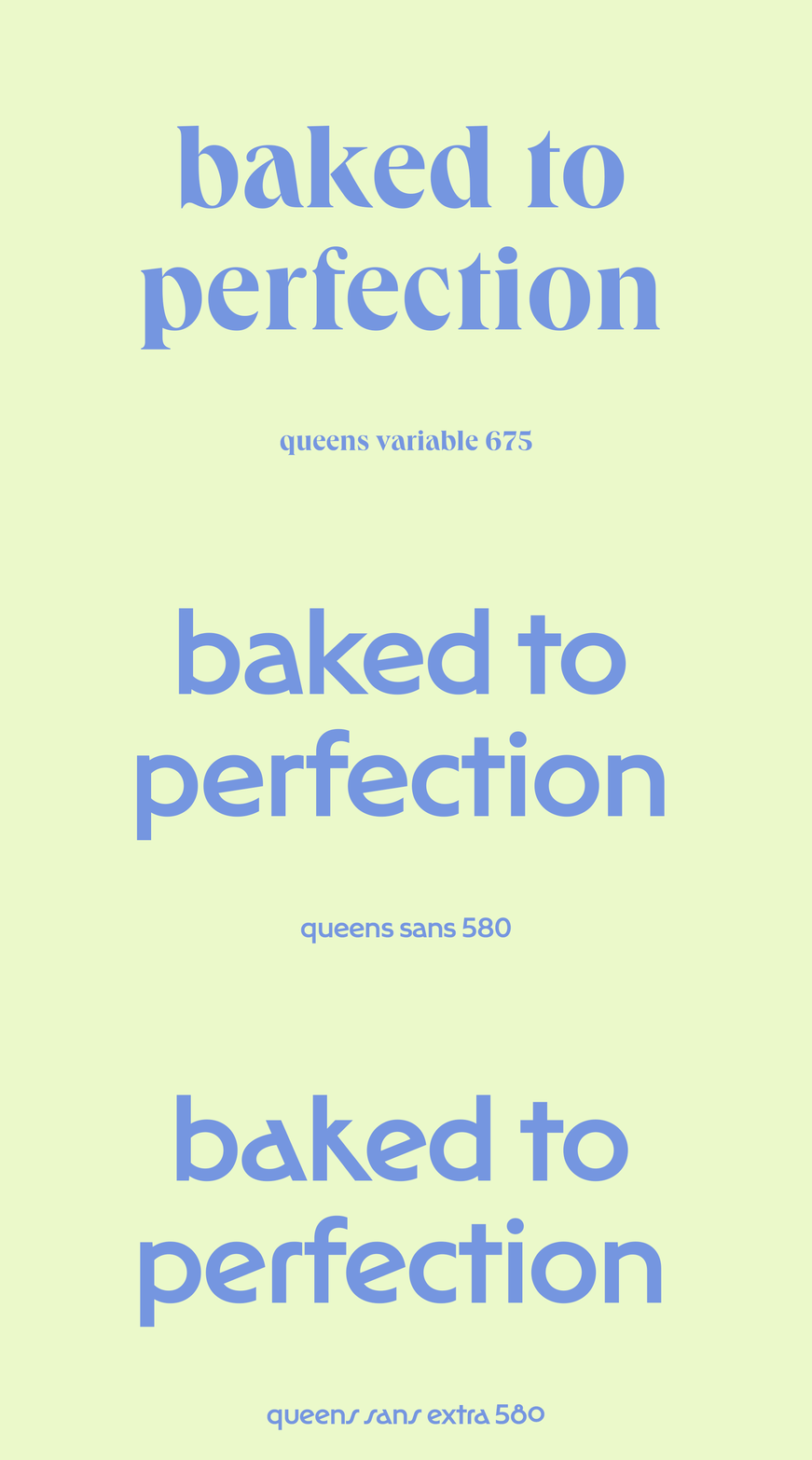
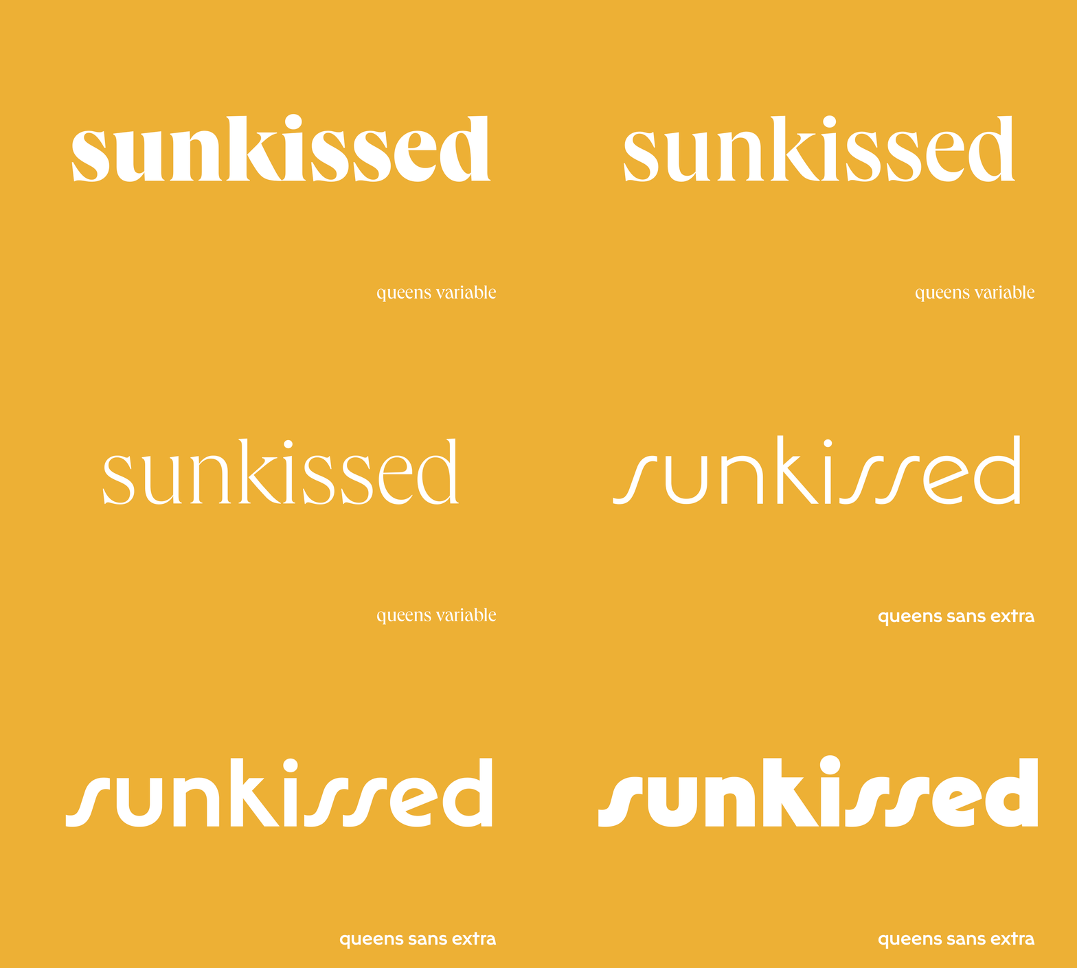
Queens is an elegant yet quirky and playful serif font by kilotype, one of my favorite independent type foundries. It is inspired by the elegant bidonis and didots, but less strict in its construction which results in a more personal feel.
I love it in bold because it exaggerates the thick-thin contrast in the letterforms and really shows off the backwards leaning a and alternating stress angles in some of the letters that adds to the overall character. Its elegant, elongated letters give off Mediterranean/ European vibes. This feels even more prominent in its sister font families, queens sans and queens sans extra. Interestingly, these sister families do not have the same thick-thin contrast giving them a very modern feel. All three font families are variable weight giving you extremely precise control.
credit: BLC Design
visual keywords: elegant, refined, modern, quirky, personable, elongated, youthful, vibrant
perfect for: skincare or beauty products, refined artisanal sweets, gourmet bakery or grains, Mediterranean or European fare, new American fare
$$- between $50 and $100 for a desktop license (single font weight)
5. milk bar ($)
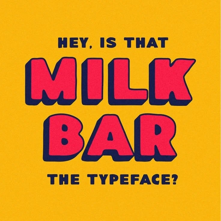
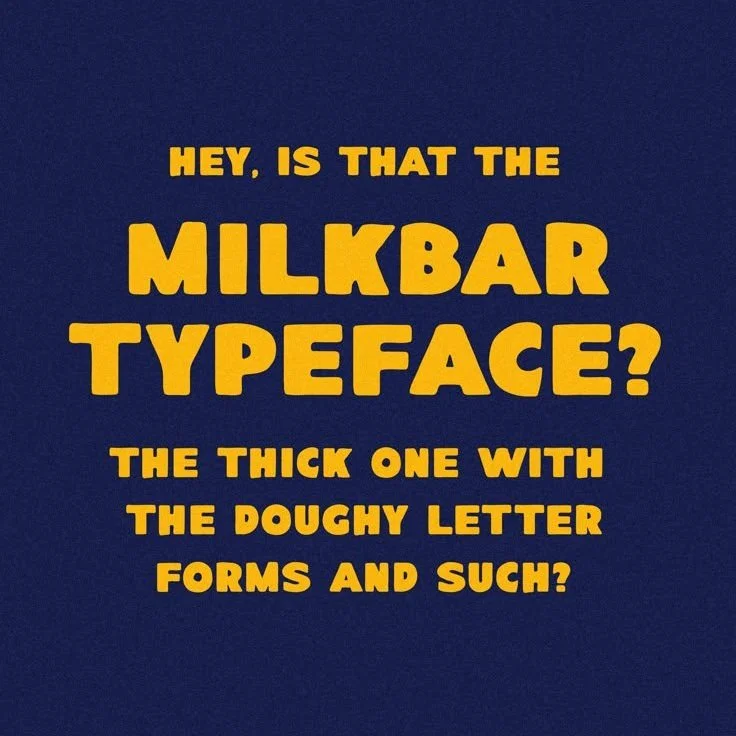
Milk bar is “the fat ass sans font we never knew we needed” according to its designer, Taylor Penton. Bold, blocky, + doughy with hand drawn, carefree surf vibes, it is full of character. It screams ice cream, relaxed summers, and youthful whimsy.
visual keywords: blocky, doughy, soft, pillowy, bold, imperfect, handmade, youthful, nostalgic, thick, carefree, relaxed
perfect for: ice cream, donuts, pizza + other doughy foods, nostalgic sweets, coastal snacks, surfer fare, seafood, cocktail mixers
$- under $50 for a desktop license
6. pink sugar ($)
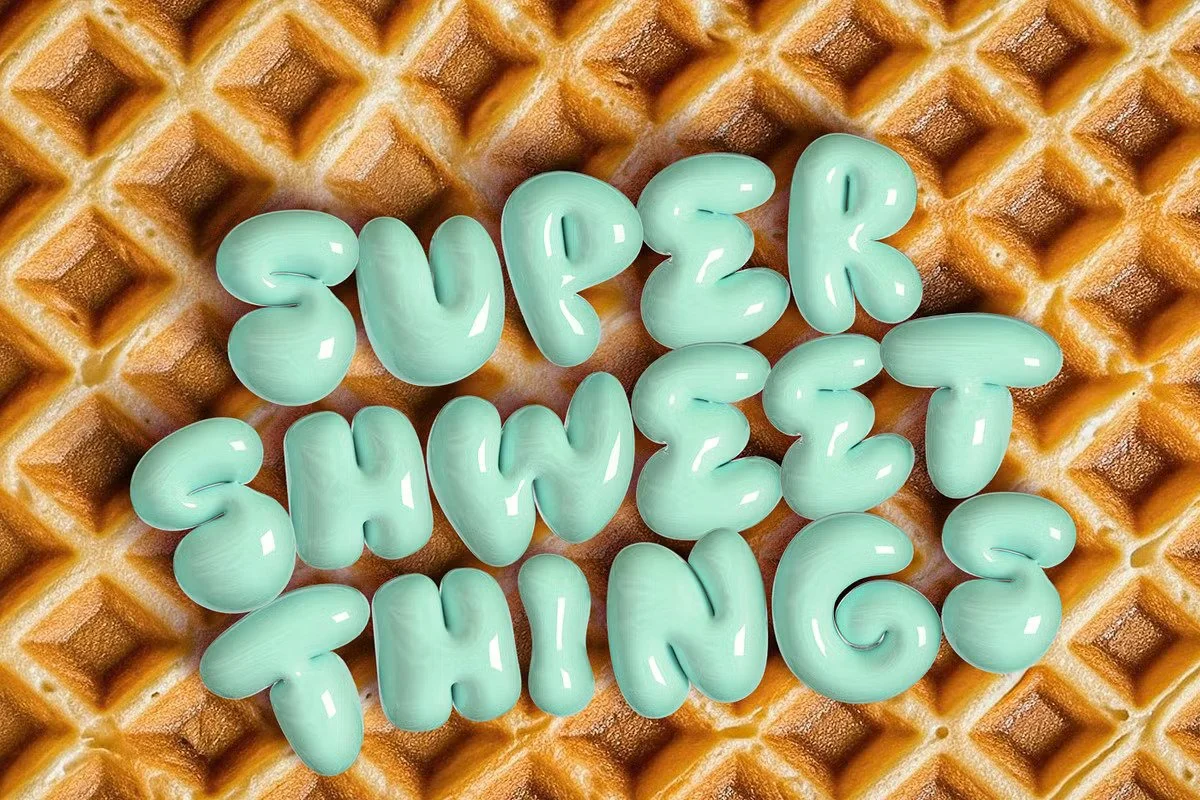
Pink Sugar is a display font by Nicky Laatz that is literally ready to pop. Exuberant, curvaceous, and bursting at the seams, if you loved the Slurpee rebrand then this font is definitely for you.
Pink Sugar is unique in that it is actually a bitmap font, meaning each character is actually a digital image composed of individual pixels. The best way to use the font, according to its designer is to use the PNG version. The font color can easily be adjusted in photoshop using a hue saturation adjustment layer, and the designer has included some demo files to walk you through this.
visual keywords: effervescent, bubbly, ballooned, pudgy, rounded, bold, shiny, plastic, bloated, bursting, exuberant, curvaceous
perfect for: sweets, bubble gum, candy, popcorn, bubbly beverages, childhood nostalgia treats, spicy food, or any product that packs a punch, a pop, or a crunch
$- under $50 for a desktop license
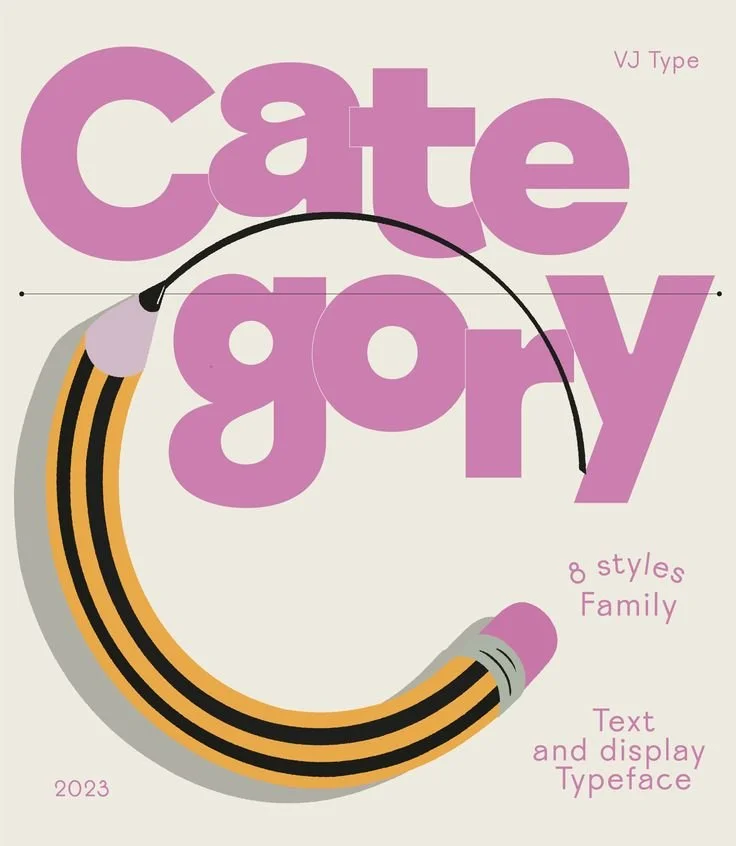
7. category ($$)
credit: VJ Type
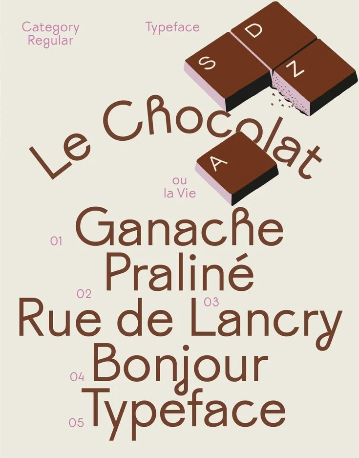
credit: VJ Type
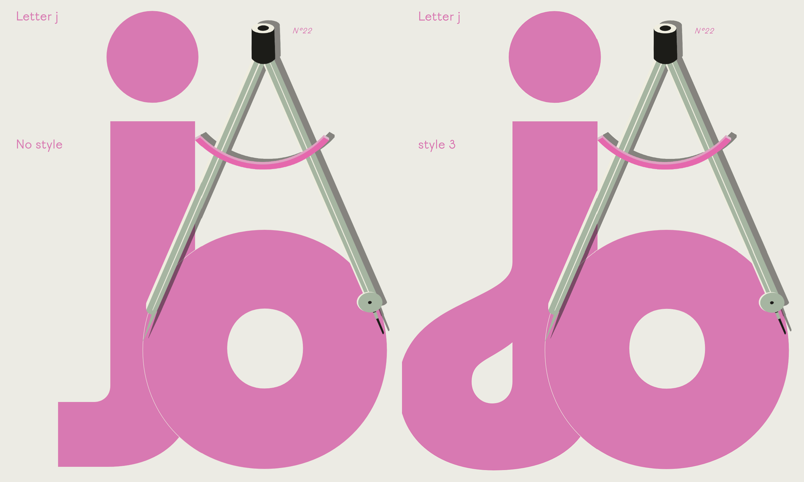
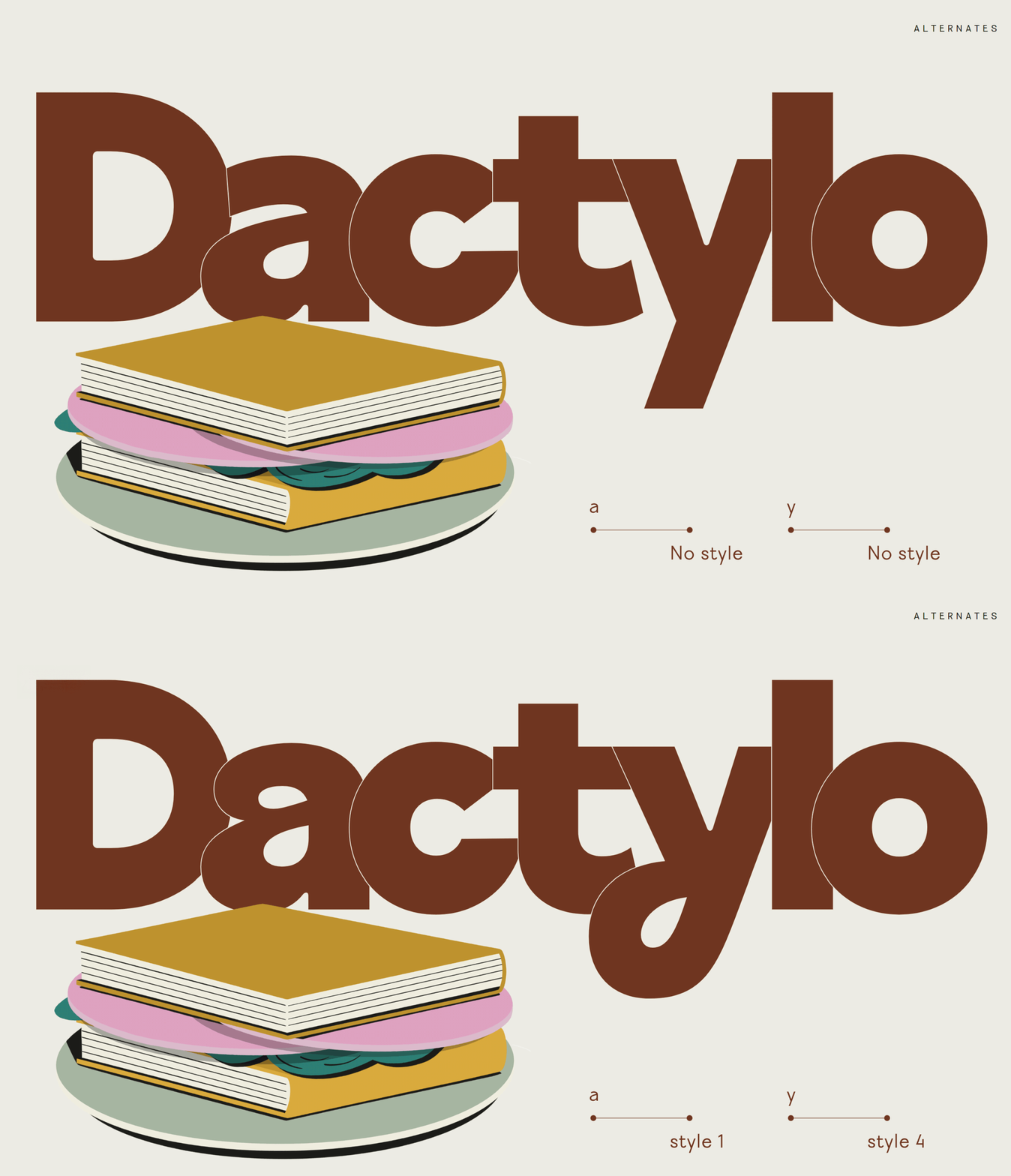
Category by VJ Type is a flexible font that can be thin and elegant or bold and quirky. It is a geometric grotesk font with low contrast and highly geometric letterforms, but with elegant, curvaceous quirks. These are most clearly evidence in the lowercase a, g, j, h and y. There are 4 styles to choose from which use different combinations of stylized letters. For example, style 1 uses the stylized a and g but the more plain geometric h, j, and y. Style 2 uses the stylized g and h but more plain a, j, and y. Style 3 uses the stylized g and j while style 4 uses the stylized g and y.
credit: VJ Type
credit: VJ Type
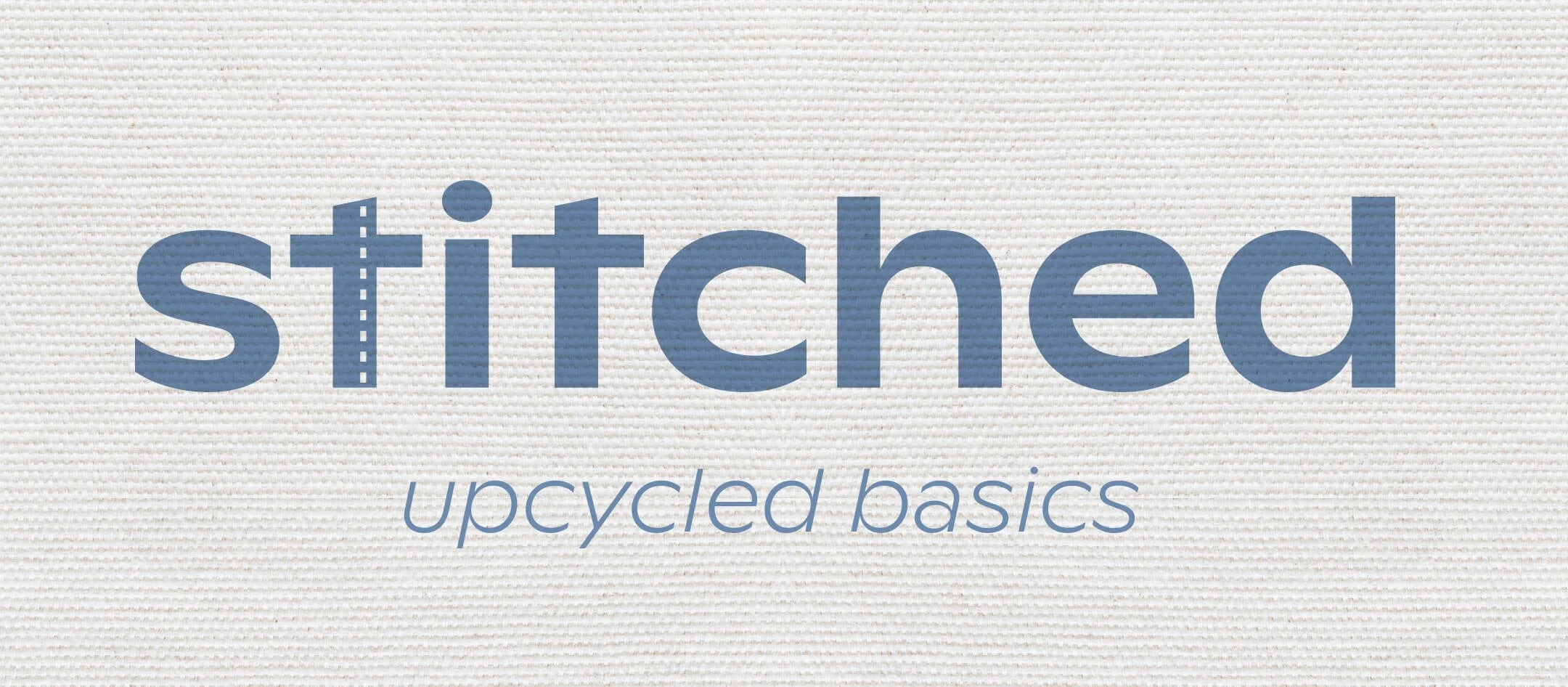
The uppercase B, P, and R have a slant that adds extra character and elegance. It features a modern yet elegant Q and K. The uppercase G also resembles a recycling arrow, which could evoke rejuvenation, upcycling, or recycling. Be sure to check out all VJ Type fonts because there are a lot of varied fonts full of character. I also love Eros, Voyage, Cako, and Nord.
visual keywords: elegant, rejuvenating, curvaceous, fanciful, modern, refined, quirky
perfect for: chocolate bars, bakeries, pastries, Parisian products, refined beverages, skincare products, clothing brands, upcycled goods, artisanal products
$$- between $50 and $100 for a desktop license (single font weight)
8. Kocha ($)
credit: Point & Poem
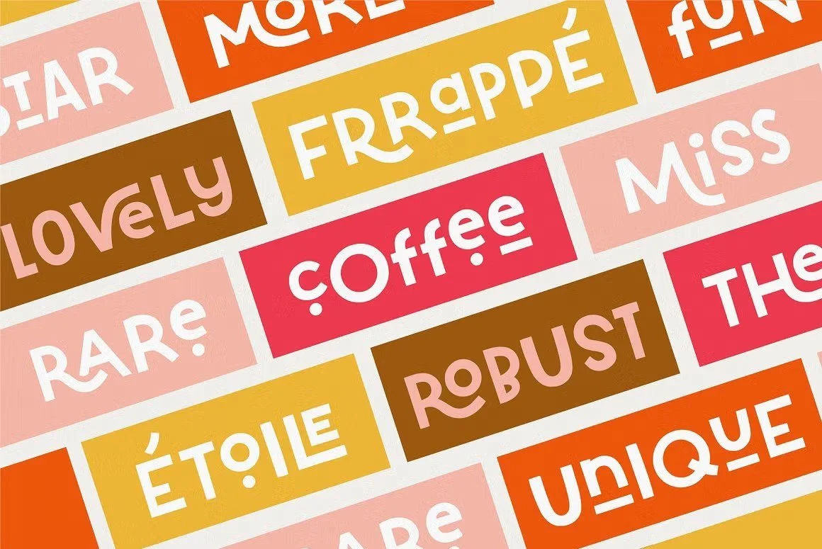
Kocha is a funky, fun ligature font by Point & Poem. It is very playful and dynamic with a mix of uppercase and lowercase characters. There are multiple alternates for most characters (plain, dotted, and underlined) and many ligature options. This gives you a ton of flexibility to experiment with different type styling and change the focal point and character of your logo.
You can also extend and customize the visual language of the font to further match your branding. For example, in this dog shampoo pods logo concept for a brand called Hello Buddy, I altered the underline character to be a dog bone and swapped the U for the logo symbol.
credit: BLC Design
visual keywords: funky, fun, whimsical, energetic, frenetic, childlike, playful, charming, handmade
perfect for: children's brands, pet products, bento box, cafes, restaurants, energy drinks, coffee
$- under $50 for a desktop license
9. Ginto ($$$)
Ginto and it's sister font, Ginto Nord are lively geometric humanistic sans serif fonts released by independent type foundry Dinamo, designed by London designer Seb McLauchlan.
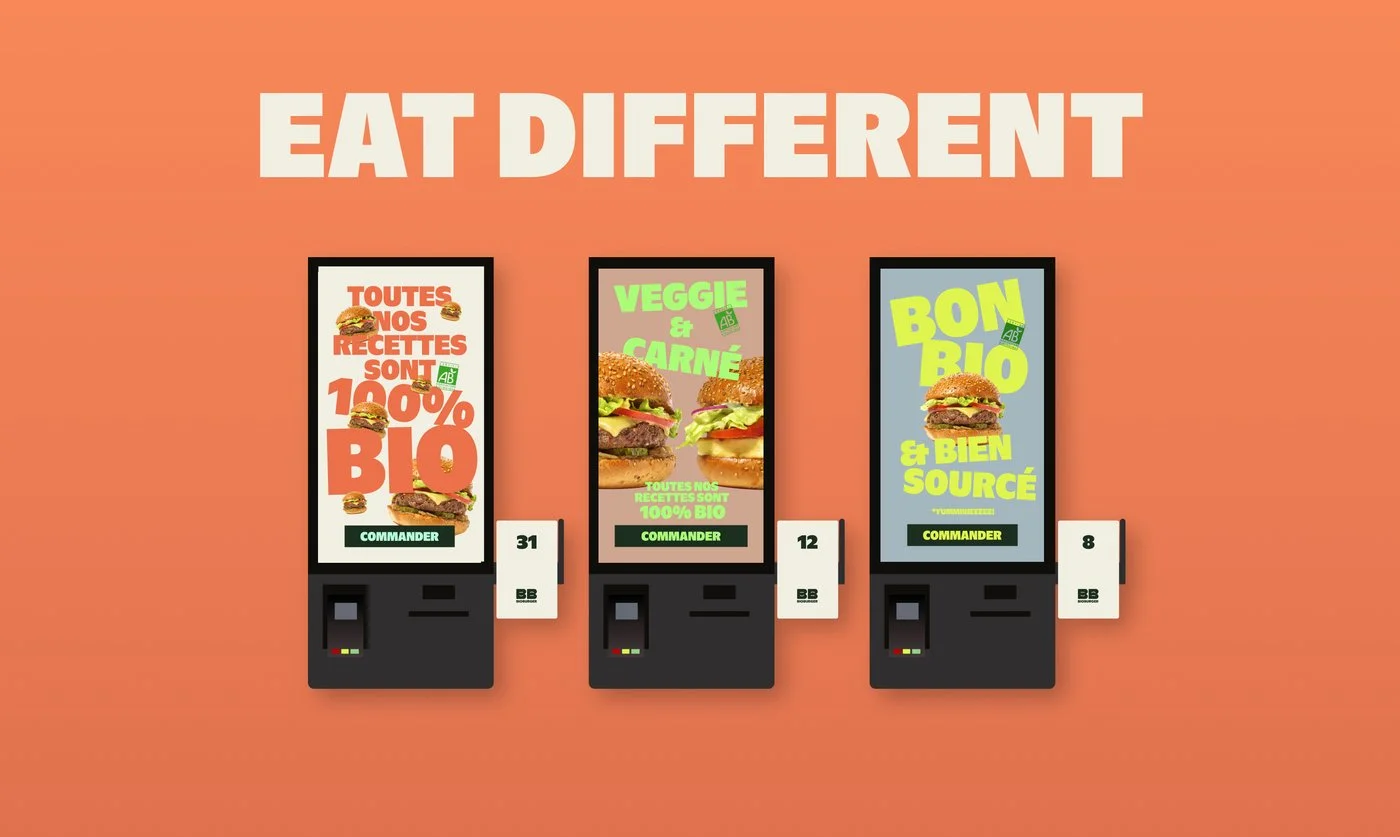
Both fonts are available in variable weights and both scream modern yet charismatic. Ginto Nord has higher x-heights, giving it a more amped up, exaggerated, bubbly personality. At its ultra and black weights, it evokes the ever famous Gill Sans (think Finding Nemo and Toy Story logos).
credit: BLC Design
visual keywords: hyper-modern, exuberant, poppy, bold, geometric, european, informal, defiant
perfect for: hyper modern brands, Gen z targeted products, plant based or dairy alternates, upcycled products, playful yet modern European or Nordic products, refined children's products
$$$- between $100 and $200 for a desktop license (single font weight)
10. omicron ($)
credit: BLC Design
Omicron is a chunky, irregular display font by Yeahright Type Studio that features thick horizontal cross bars, with comparatively thinner vertical stems and narrow yet wide counters. The result is rounded yet blocky letterforms that give strong horizontal lines/ emphasis and feels very wide and pillowy.
visual keywords:
perfect for: ramen, noodles, mac and cheese, egg replacement product, ice cream, dim sum, bao, fluffy/pillowy treats or doughy foods like donuts, beignets, or pizza
$- under $50 for a desktop license
The fonts you pick shape how people experience your brand. As a founder, you’re juggling a thousand decisions every day, and choosing type may seem trivial or overwhelming. However, your packaging design and the fonts you choose are critical. Packaging is one of the key ways your vision shows up in the real world. These font suggestions are a great starting point, but if you’re at the stage where DIY isn’t cutting it, I’m here to help.
I team up with startup food, beverage, and lifestyle product founders to design branding and packaging that’s clear, authentic, and sure to stand out on the shelf and online. Ready to bring your vision to life? Let’s chat.


