

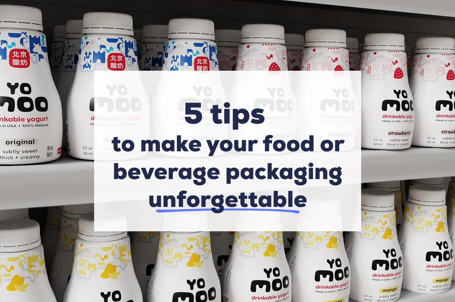
5 tips to make your food or beverage packaging unforgettable
In my last article, I told you about 10 things your food or beverage packaging MUST include by federal regulation and modern consumer standards. Now I want to share with you some tips that will help you go beyond what is required to make your packaging truly stand out on the shelf. Here goes!
1. Include User-research backed keywords, phrases, or comparators.
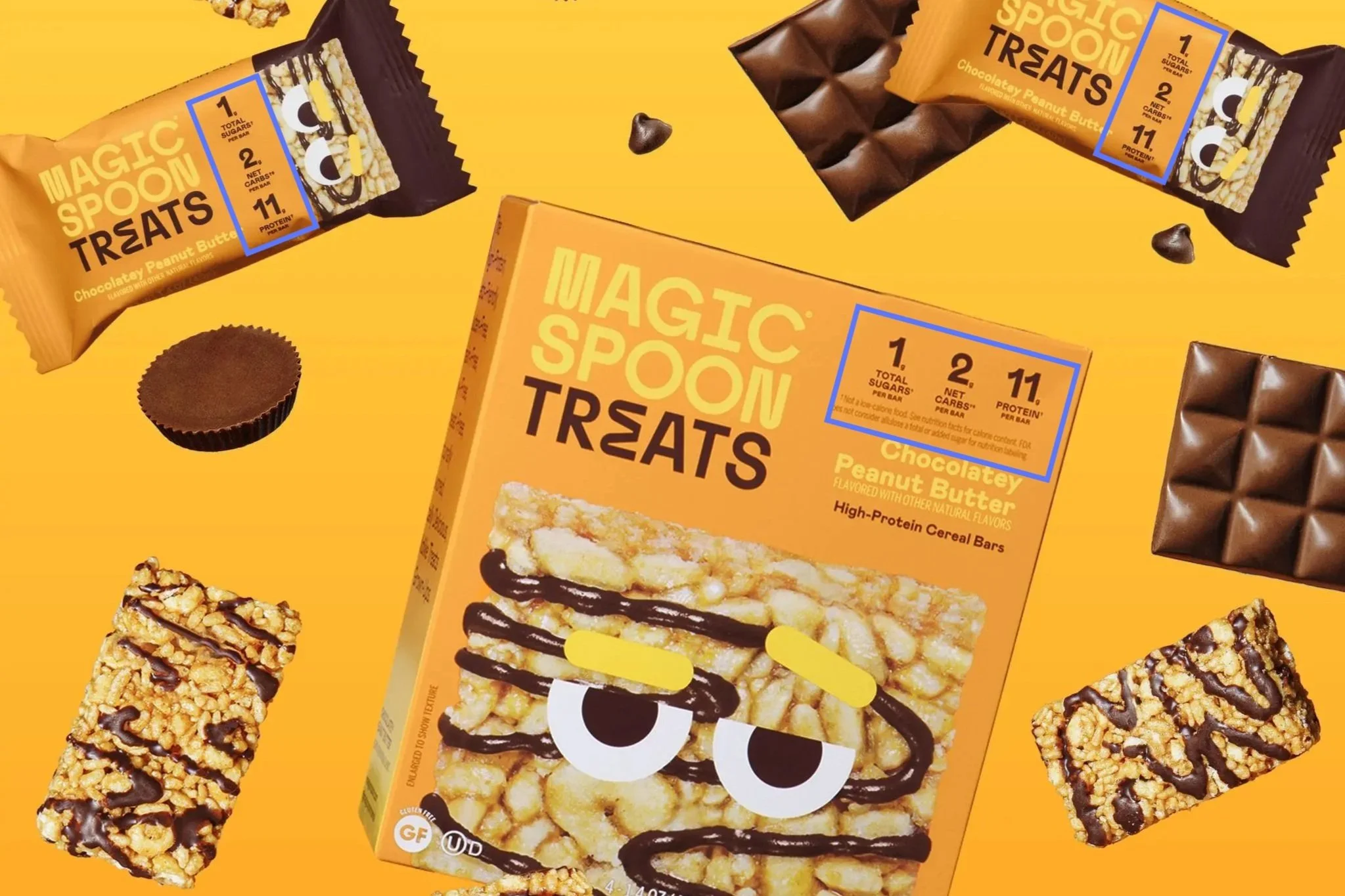
What are the keywords, phrases, and/or comparisons that people need to see when choosing your product? You can uncover these through focused user interviews, product-related surveys, and/or competitive research. Prioritize 2-3 keywords or statistics on the front of your packaging. For example, in the Magic Spoon Treats® packaging shown, they’ve identified three key nutrition facts to highlight clearly on the front (total sugars, net carbs, and protein per bar).
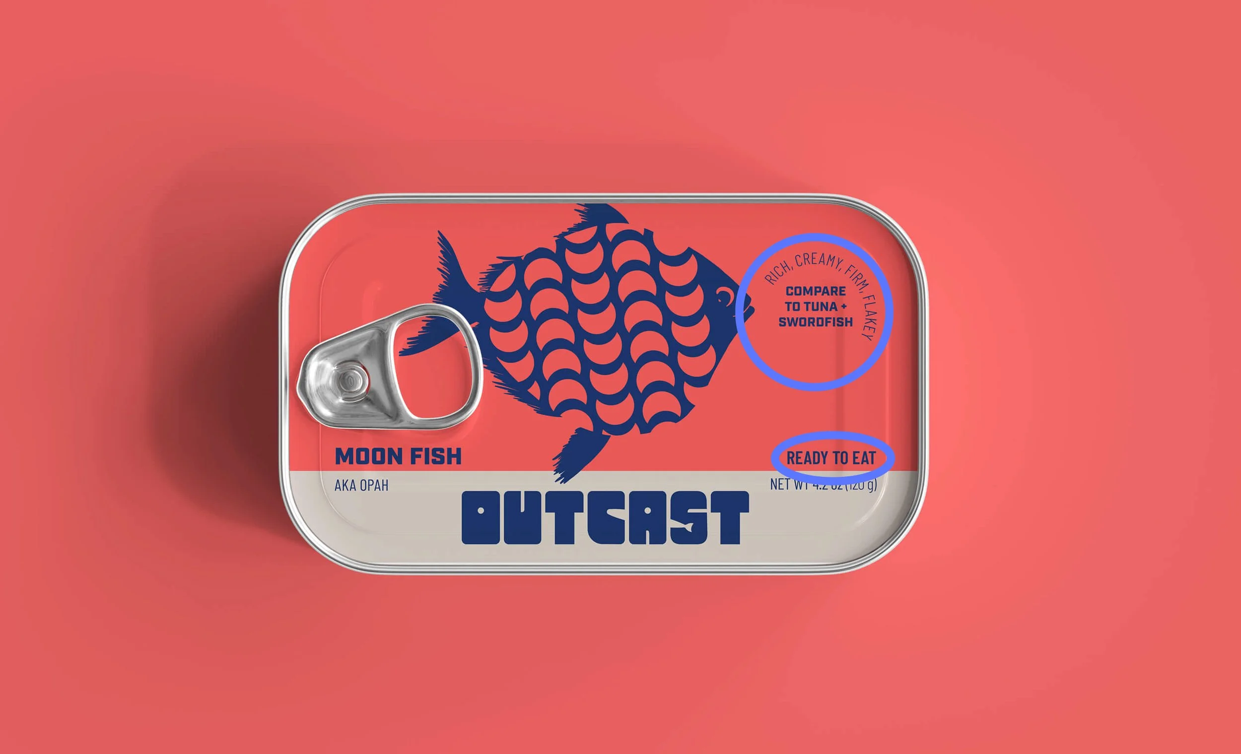
Creative lockups or badges can help squeeze in critical phrases on the front and call attention to them. For example, for the Outcast packaging, we identified three critical pieces of information that our audience needed to see. 1. The flavor and texture description (rich, creamy, firm, flakey); 2. A comparison fish that they are more familiar with (tuna, swordfish); and 3. that the snack was “ready to eat.”
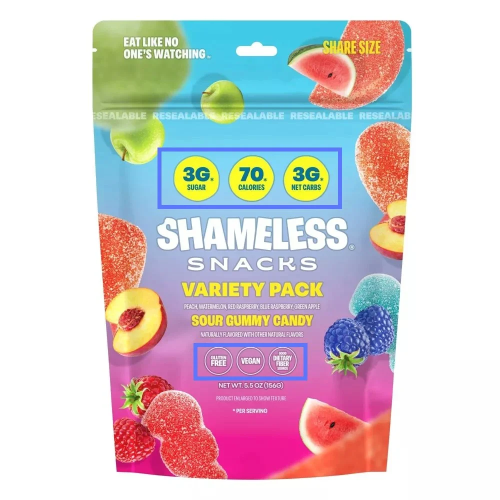
If you have an FDA-compliant nutritional claim or health claim, this might be one of your key phrases/features to include in a creative lockup. For example, the Shameless® Snacks packaging makes the FDA-compliant nutritional claim “Good Dietary Fiber Source” as one of its key phrases. Key product features should be displayed clearly using on-brand icons or an easily digestible bulleted list. If your product meets a specific certification such as MSC- certified, organic, or another standard, you should include the official certification icon on the front of your packaging as well.
2. include your compelling “why.”
Your compelling why could also be a condensed version of your product story. When writing your compelling “why” or condensed story, you should address these questions:
\\ Who is this product for and how does it make their life better? Remember, the most powerful product stories position your ideal audience as the hero. How does your product help them overcome a challenge they face? How does it help them become someone they desperately want to be?
\\ How did this product come to be? Emotional stories resonate deeply with people. What were the memories and experiences that inspired it, that your ideal audience may instantly connect with?
\\ What culture does it originate from, and what value does it serve for that community? How can your audience benefit from or experience this value for themselves through your product?
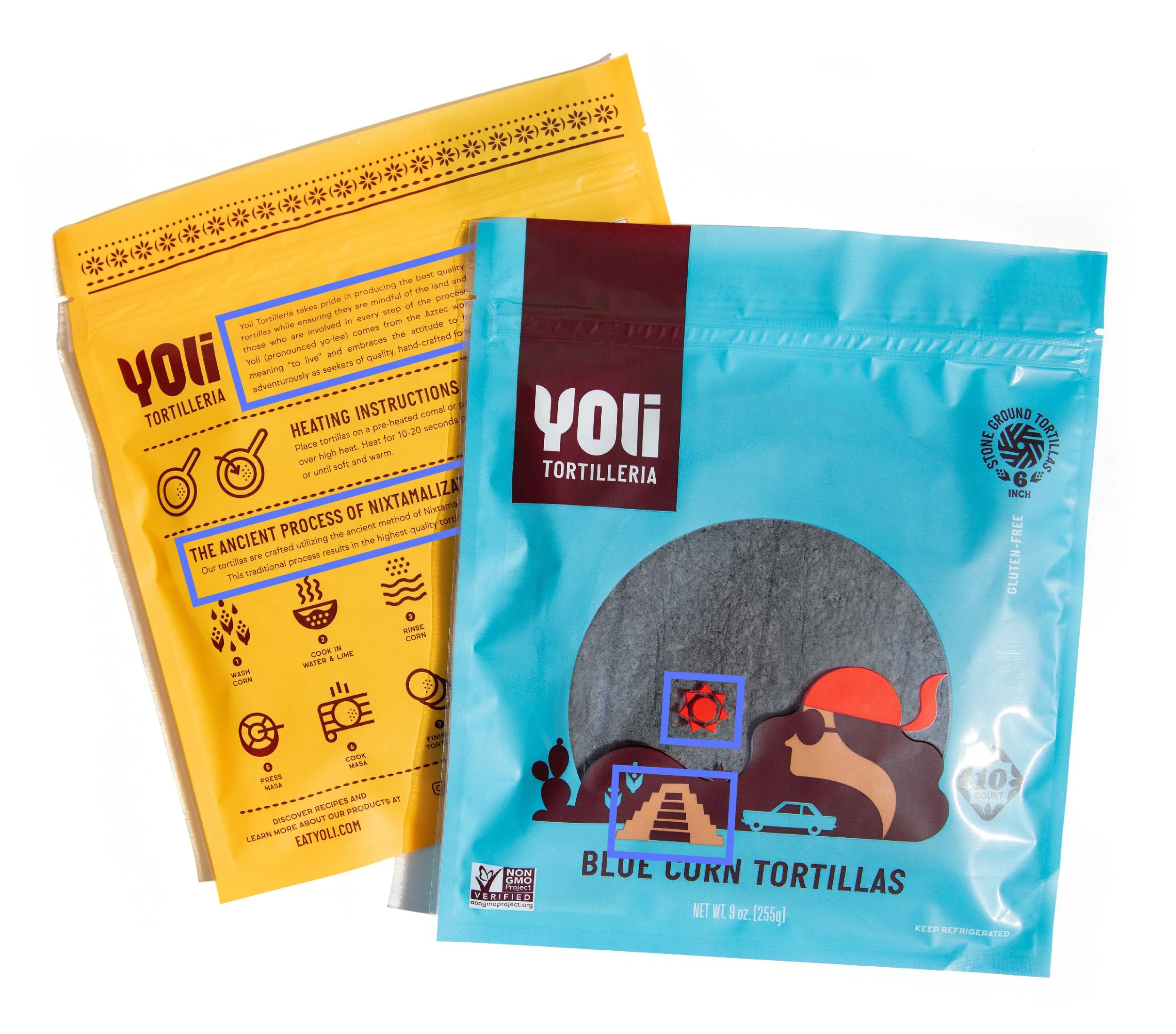
Edit and condense your story as much as possible– attention spans are short these days. Your story should live on the back or left side panel of your packaging, but you might include subtle references to it elsewhere in your brand imagery or word choice elsewhere on the packaging. The Yoli Tortilleria packaging is an excellent example of a compelling “why” that tells about cultural context and how that directly benefits its eaters. They include a product story and information about the health benefits of the ancient process of nixtamalization. They explain the brand name, yoli, as an aztec word meaning “to live” and connect this to an attitude of eating adventurously and seeking the highest quality. This connects deeply with people who aspire to explore new cultures, honor traditions, and discover the highest quality foods from around the world. They also reference the Aztec origin story through the logo and Aztec imagery on the front of the packaging.
3. use negative space + grouping.
Never underestimate the power of negative space. It helps create a clear information hierarchy (order in which people digest information). There is a ton of information that you need to include on packaging, and the last thing you want is to clutter your packaging and overwhelm your audience. Negative space gives your brain breathing room and actually makes it easier to digest one piece of information at a time
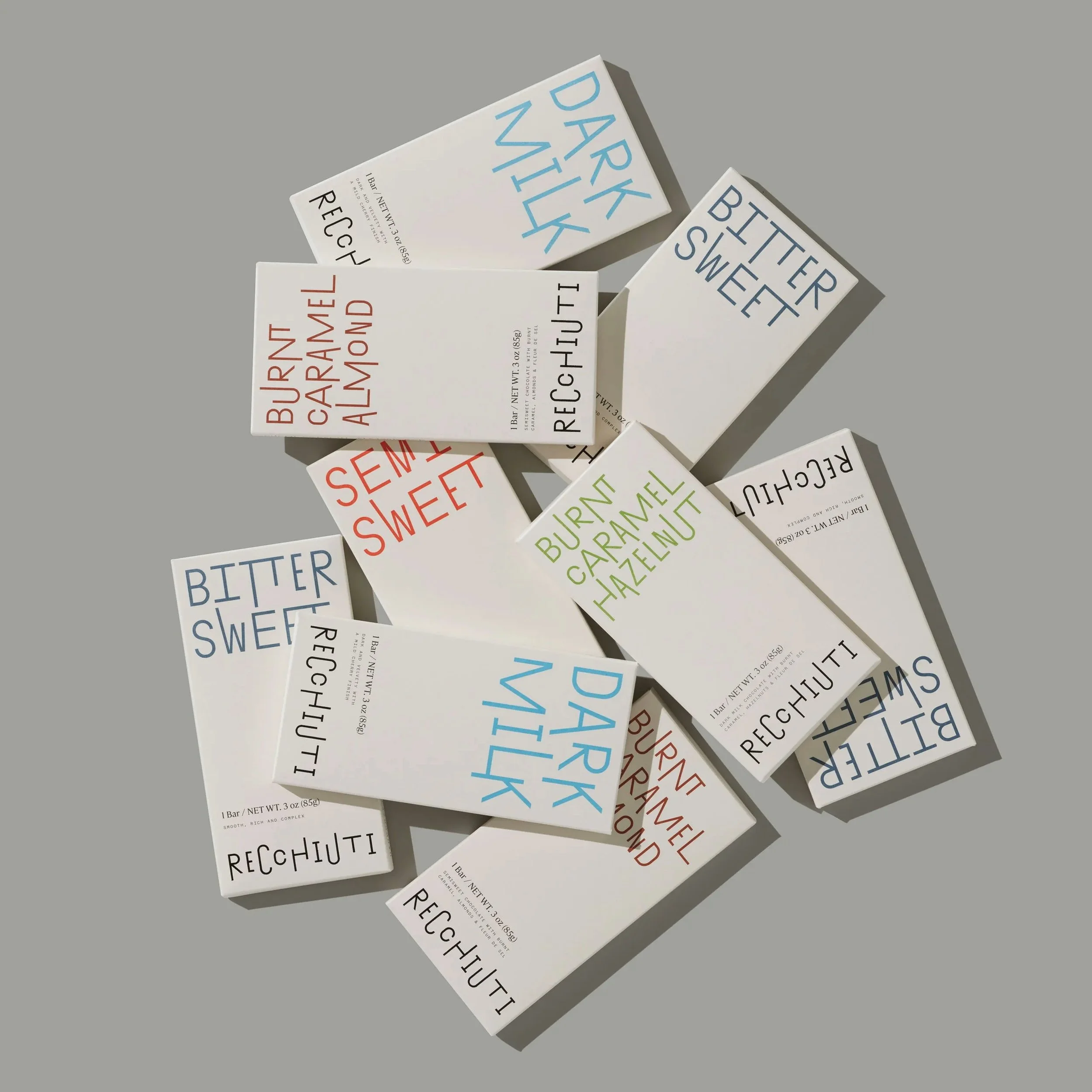
A classic mistake is to try to make every piece of information as large as possible. If everything is big and bold, then nothing is. The chocolate bar packaging from Recchiuti is a good example of restraint. They create a clear hierarchy through negative space— in fact, about one-third of the front label is negative space! The flavor is large in stylized text, and separated substantially from everything else. The brand name is second in the hierarchy, smaller but in the same stylized font. The other information is substantially smaller, which gives breathing room to the other more important pieces of information.
Grouping relevant information together also makes it easier for our brains to digest information in a controlled order. This lowers the cognitive load by reducing the number of decisions we have to make about how to read the packaging and what is important.
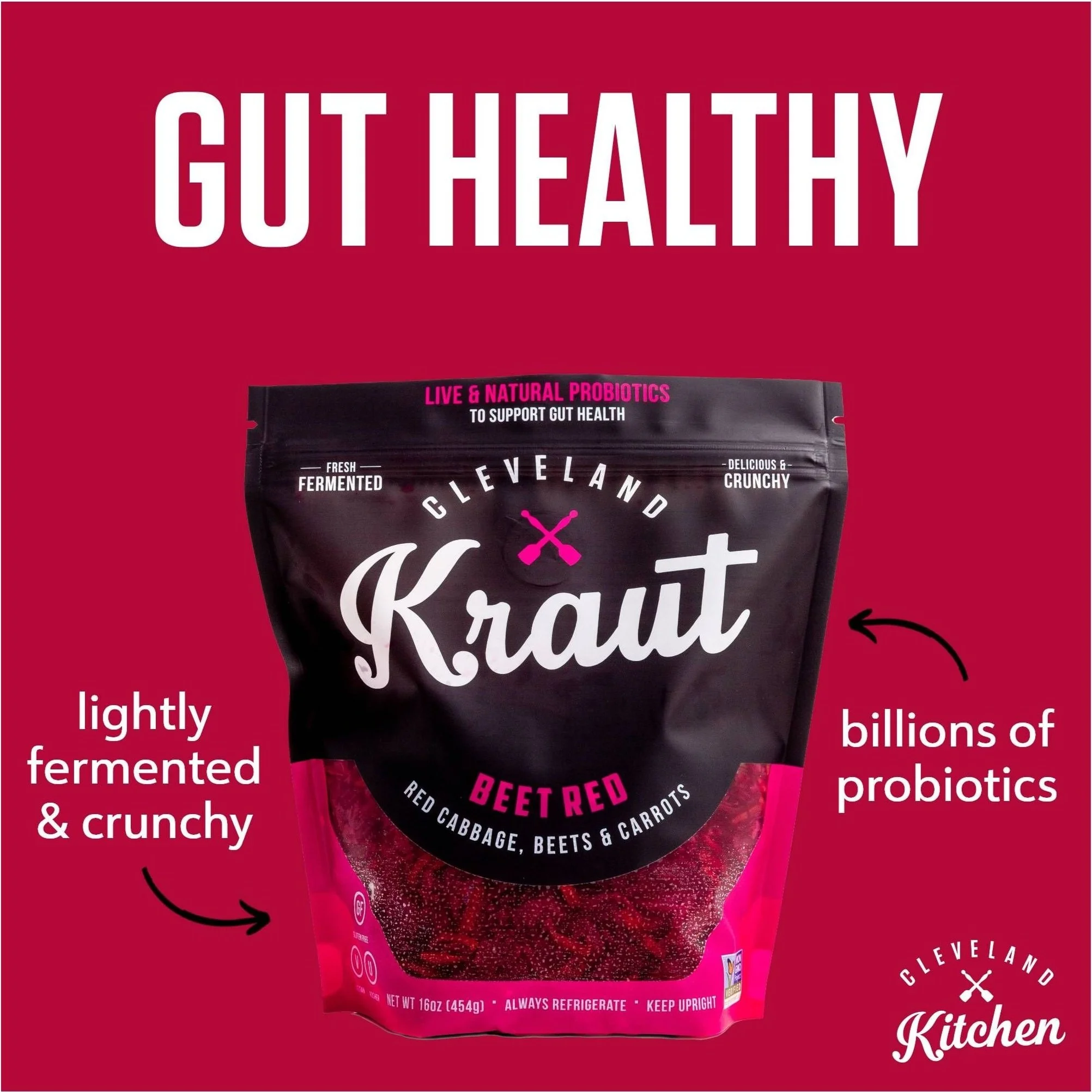
A great example of grouping is in the Cleveland Kraut packaging. At a glance, I see 6 major groupings of information. The largest is the logo, Cleveland Kraut, which is what you digest first. The second most prominent is the flavor name “Beet Red” grouped with the major ingredients “red cabbage, beets & carrots.” The next most prominent grouping is on the tear off tab, that reads “Live & Natural probiotics” grouped with “to support gut health.” Then we have two groupings styled in the same way on the top left and right, “Fresh Fermented” and “Delicious & Crunchy.” Finally, we have in the smallest type, the bottom grouping that contains the net contents declaration, food safety instructions, and product feature icons.
4. experiment with contrast in scale, weight, and/or color.
Again, contrast in scale, weight, and color help you establish the information hierarchy so you better control the order in which your audience digests each piece of information. If everything is big, nothing is big. Avoid the temptation to make everything as large as possible and instead pick and choose which items should be seen first, and make those the largest and/or boldest. In order to maintain negative space, some important elements will need to be small. That's okay, as long as they contrast enough and have sufficient separation from the other elements, they will actually be more legible. Just ensure that FDA-required information meets the minimum size standards.
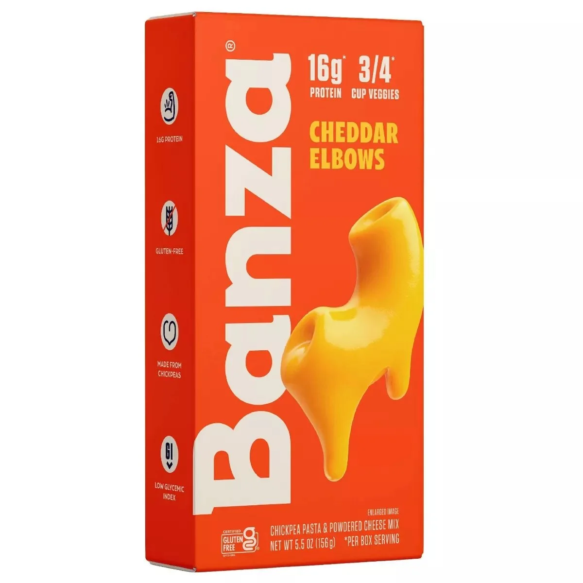
I love the packaging from Banza® Cheddar Elbows as an example of this. The logo uses contrast in scale, weight, and orientation to draw attention to it immediately. The next most prominent information in the hierarchy is the stylized photo of the noodle itself. So instantly we know the brand and what the product is with very little time spent processing. Next, we see the product type, Cheddar elbows, followed by the protein and veggies per serving. The product identity statement, net contents declaration, and gluten free icon are lowest in the hierarchy, substantially smaller and lighter weight than the logo, product name, and key nutrition stats.
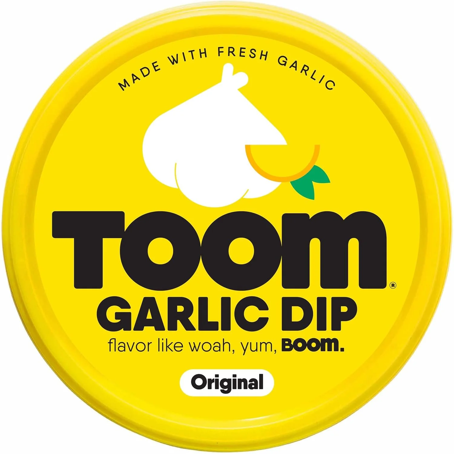
I also love the TOOM® garlic dip packaging as an example for contrast in weight. The logo is an extremely heavy weight font, which instantly draws the eye. GARLIC DIP is slightly lighter weight, and slightly smaller, but still very bold and grabs your eye next. The next piece of information you digest is the flavor, which is smaller in scale but equally bold in weight, against a more contrasting background (white). The other text (minus the word “BOOM” are set in ultra lightweight, thin type. This contrast between thick and thin really controls where your eye looks around the lid.
5. infuse your packaging with personality.
Personality should touch every element of your packaging. You should brainstorm two to three keywords that summarize your brand personality and these should come across both through the visual and word choices you make. Every word, icon, photo, and illustration is an opportunity to inject personality. Creative taglines and flavor/variety names are a huge opportunity to inject personality. Font choice also plays a significant role in conveying personality and tone.
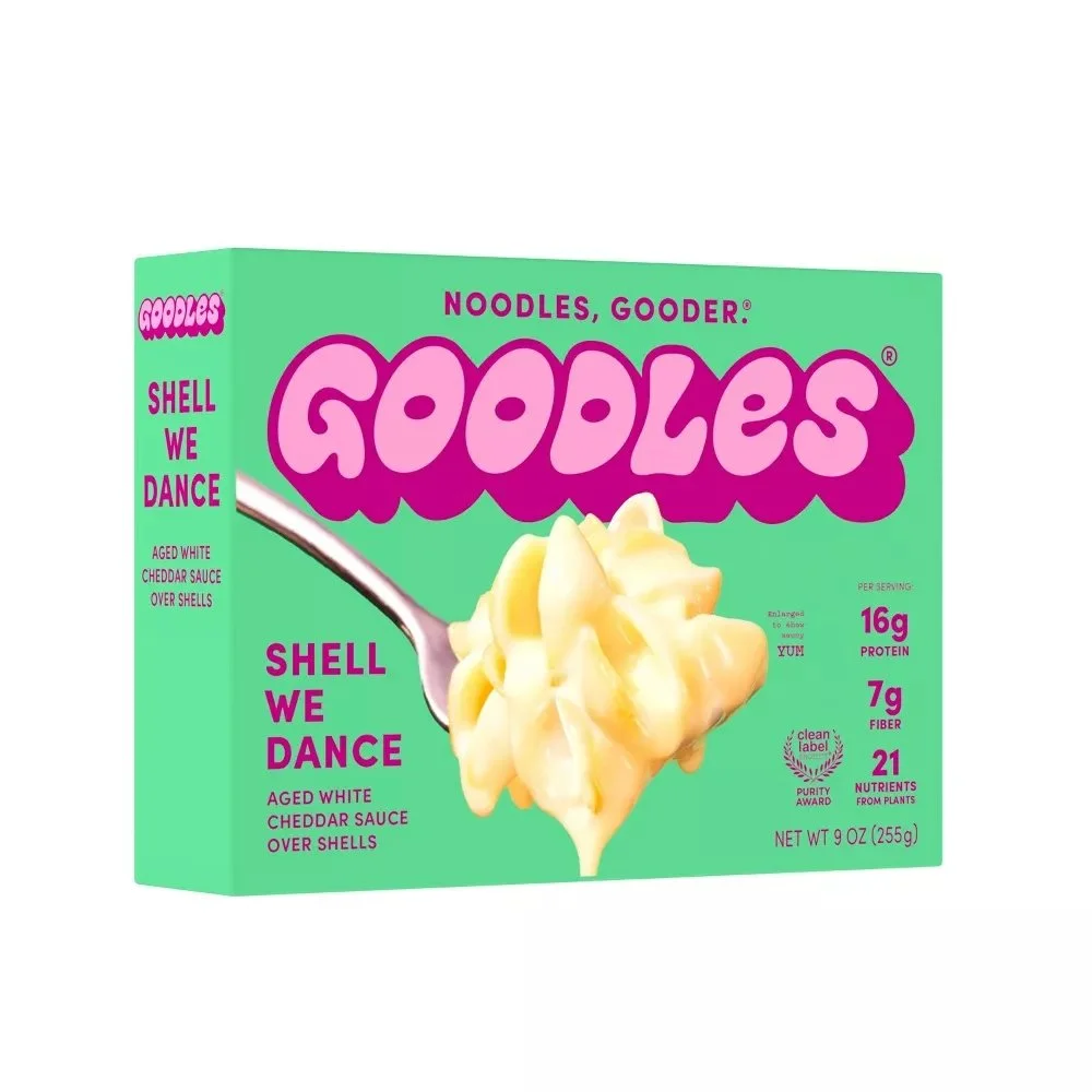
The Goodles® packaging does an excellent job of projecting a bold, playful and childlike personality. The thick, curvaceous lettering in the logomark has a carefree, playful tone. The tagline, Noodles, Gooder® also adds to a childlike innocence by using a made up word that a child would use. The product name, “Shell We Dance” is a pun that adds silliness. If you look closely, even the “enlarged” disclaimer is infused with personality: “enlarged to show saucy YUM.”
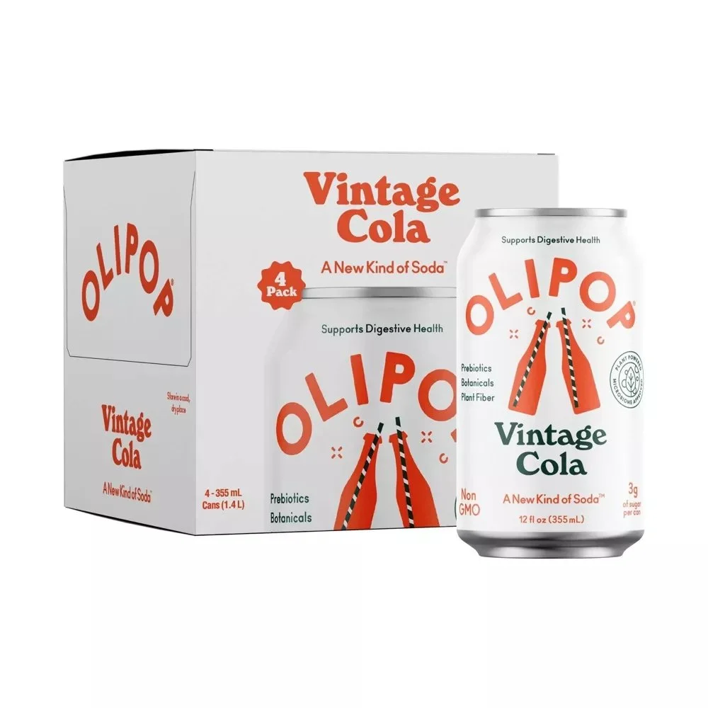
Olipop® also infuses their packaging with a nostalgic yet modern personality. Flavor name choices like “Vintage cola” and “Classic Rootbeer” set in a retro 1970s style rounded serif font (evoking the classic hippie-era Cooper Black font) add to the nostalgic vibe. The logotype itself is an extremely modern, geometric sans serif as well as the tagline, “A New Kind of Soda™”, which emphasize a modern twist. The illustration portrays a vintage shape of soda bottle and a vintage straw, but set in a modern, flat iconography style.
I hope you enjoyed these five expert tips to make your food or beverage packaging truly unforgettable. Moving beyond compliance, these suggestions aim to help you captivate consumers, enhance shelf appeal, and reinforce brand identity. Whether you're launching a new product or refreshing an existing one, these tips will help your packaging leave a lasting impression.